

Jul 7, 2025
12min read
Running an A/B Test That Actually Works
TL;DR
A/B tests can be your secret weapon for reducing guesswork in experiments, but only if you do them right. This guide walks through the full process, from hypotheses and power analysis to randomization, metric design, and interpreting the outcome. No more vanity metrics, no more premature launches, and absolutely no more “it feels better, so let’s ship it.”
Also, yes, I’ve spent way too much time thinking about this and the silly jokes. Writing this post definitely took less time than overthinking it.
Section 1: Introduction
If you’ve worked on any customer-facing team, whether at Amazon, Flipkart, or even a scrappy startup, you’ve likely had this moment:
“We’ve built something cool… should we just ship it?”
It might be an AI powered reply generator, a new way of categorizing support tickets, or a change in how you escalate issues. It feels intuitive, it looks better, and the team is excited. So why wait? After all, when has rushing into a release ever backfired? (Don’t answer that.)
But here’s the catch: launching without testing often means you learn nothing. If satisfaction scores improve, was it because of the new system or a seasonal uptick? If response times drop, was it your update or just a quiet week (More on this later)? Worse, if things go sideways, you’ll struggle to isolate why.
This is why A/B testing matters. Not because it’s fancy, but because it’s the simplest way to answer the one question every team should care about:
Did our change make things better?
Let’s take an example of the custom response generator I created a month back. Yes, I know it’s been a while since that post. But good things come to those who wait (I guess)?
Now, you might wonder, why not just compare metrics before and after the change? Or test with a small group of issues first? Sure, those are options, but they come with hidden risks. Time-based comparisons don’t account for shifting ticket volumes, holidays, or unexpected bugs. Internal pilots are often biased, since your best agents will adapt quickly and skew results. Surveys only capture the loudest voices.
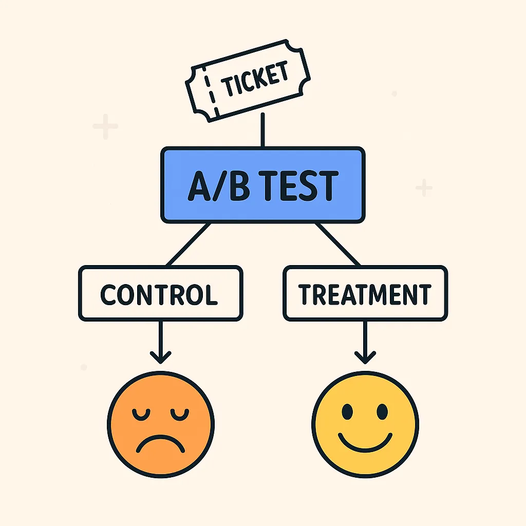
In contrast, a properly designed A/B test lets you isolate the effect of your change by comparing two randomly selected groups. One using the new system, one sticking to the old under nearly identical conditions. Of course, deciding to run an A/B test is just the first step. Designing a test that’s statistically sound and practically useful takes a bit more thought. The second step is explaining to your PM why you can’t just “eyeball the numbers.”
That’s what this post is about: a step-by-step breakdown of how to run an A/B test that actually works, especially in environments like customer service where data is messy, users are impatient, and trade-offs are everywhere.
Section 2: Designing the Experiment
Once you’ve decided that an A/B test is the right move, the next step is designing it properly. This is where many teams go wrong, either by underestimating how much data they need, picking the wrong metric, or stopping the test too early because “the results look good.” A solid design ensures that your test results are not just statistically significant, but also meaningful and actionable.
It starts with defining your hypotheses. The null hypothesis usually assumes that there’s no difference between the current system and your proposed change. For example, that your new AI generated replies have no effect on resolution time or customer satisfaction. The alternative hypothesis is what you’re hoping to prove: that your change has a real, measurable impact.
Once that’s clear, you need to think about sample size and minimum detectable effect (MDE). The MDE is the smallest improvement that actually matters to you, say, reducing time to resolution by 10%. The smaller the effect you want to detect, the larger the sample you’ll need. That’s where statistical power comes in. Power is the probability that your test will detect a true effect if one exists, and it’s usually set to 80% or 90%. Along with your significance level (commonly 5%), these factors work together to define how long you’ll need to run the test and how many users or tickets need to be included.
Here’s the tricky part: there’s always a trade-off. You can’t have high power, a small sample size, and a low budget. Pick two. (And by “pick,” I mean your exec team already picked for you.) Want to detect smaller improvements? You’ll need more users or a longer test. Want to run a short test? You’ll only be able to detect big changes. There’s no magic formula, just a balance between speed, precision, and business impact. That’s why you should always run a power analysis before starting your test. It helps you understand what’s realistic and keeps you from wasting time on tests that were doomed to fail from the start.
And don’t forget about test duration. Even if you have enough total users, you need to run the test long enough to capture typical behavior including weekday vs weekend patterns, spikes in ticket volume, or slow-moving metrics like customer satisfaction. Ending a test too early, even with “enough” data, can lead to misleading results if the behavior isn’t representative. A good rule of thumb is to run for at least one full business cycle often one or two weeks to smooth out natural fluctuations.
2.1 A Bit Deeper: Power Analysis & Sample Size Calculation
A good A/B test isn’t just about what you want to measure — it’s also about knowing whether you can measure it. Power analysis helps you determine how big your experiment needs to be to detect the effect you care about.
There are four key ingredients:
Significance level (α) — The probability of a false positive, usually set at 0.05 (5%)
Power (1−β) — The probability of detecting a true effect, usually 0.8
Minimum Detectable Effect (MDE) — The smallest change worth detecting (e.g., 10% drop in Time To Resolution)
Baseline variation (σ) — How much natural variation exists in your metric
Basically, it’s a recipe for statistical anxiety — but it works.
For continuous metrics like resolution time, the sample size per group is:

For Binary Outcomes (e.g., conversion rate, escalation rate):

Where pˉ is the average rate and Δp is the absolute improvement you want to detect.
Example: Suppose your current ticket escalation rate is 10%, and you want to see if the new system reduces it to 8%. You want 95% confidence and 80% power.
pˉ= 0.09, Δp=0.02
Z1−α/2=1.96, Z1−β=0.84
Plugging these values into the sample size formula for binary outcomes, we get a sample size of ~3,212 per group. So you’d need around 6,424 tickets total to detect a 2% improvement. Not massive, but not trivial either.
And that’s just one metric. If you’re tracking multiple outcomes say, escalation rate and satisfaction score, you’ll need to account for multiple comparisons or prioritize a primary metric.
2.2 Randomization: Who Gets The Placebo?
Another key decision is how to split your users or tickets into treatment and control groups. The simplest method is simple randomization, where each user or ticket has an equal probability of being assigned to either group. This works well when your population is large and relatively uniform, but in real-world systems, especially in customer service or security workflows, things aren’t always that simple.
One of the first things you need to think about is the unit of randomization, what exactly are you splitting? In a customer support context, that could be:
User-level randomization: Every user is consistently assigned to either control or treatment. This is useful when users can open multiple tickets or interact with your system over time. It avoids “cross-contamination” where a user experiences both the old and new systems, which can bias their behavior or perception.
Session-level randomization: Every individual session (chat, call, or web interaction) is randomized separately. This is useful when sessions are independent, like one off support chats, but risks variability if users show up repeatedly.
Device-level randomization: Used when users aren’t logged in. The test assigns treatment based on device identifiers (like browser cookies or IP addresses). This is often a fallback, but it’s less reliable since device sharing, cookie deletion, or VPNs can corrupt the assignment. Because nothing says “robust experiment” like betting on browser cookies and hoping they don’t clear their cache.
Ticket-level randomization: Each support ticket gets independently assigned. This might seem reasonable, but it’s dangerous if a single user submits multiple tickets and gets both experiences. It can lead to mixed signals, confusion, and even measurement bias.
In most cases, user-level randomization is safest, especially if you’re evaluating outcomes that depend on perception, behavior, or repeated interactions (like satisfaction or churn). It ensures consistency, a user either always sees the new reply system or never sees it, allowing for clean measurement.
You also need to think about how you randomize:
Simple random sampling: Flip a coin (figuratively). It’s easy, but not always balanced across important dimensions like geography, agent type, or ticket severity.
Stratified sampling: You split your population into meaningful subgroups (e.g., country, tier, platform), and then randomize within each. This ensures that treatment and control are balanced across those dimensions.
Blocked randomization: Especially useful in time-based systems (like call centers or live chats), you alternate assignments in small blocks (e.g., first 10 tickets to control, next 10 to treatment). This prevents batch effects and helps smooth out time-related confounders like weekend surges or morning lulls.
Deterministic assignment: Pro: Fast. Con: You’ll spend three hours explaining modulo logic to someone. You assign based on ticket ID, timestamp, or another hashed feature. For example, “every nth ticket goes to treatment.” It’s simple, repeatable, and works well when real-time infrastructure needs fast, lightweight logic.
But whichever method you choose, your goal is the same: make sure the only meaningful difference between treatment and control is the experience you’re testing. If your randomization leaks, say, certain teams get more of one variant, or high-priority tickets are routed only to control, your results can become misleading, no matter how clean your analysis looks later.
Section 3: Picking the Right Metrics: What You Measure Defines What You Learn
As Data Scientists, one of the most overlooked parts of A/B testing is choosing the right metric. (Because if you don’t, the PMs will, and suddenly “number of replies sent” becomes the definition of success.) Too often, teams fixate on vanity stats like “response count” or “ticket volume” without asking if those numbers actually reflect a better experience or more efficient system. The truth is, your entire test lives or dies by the metrics you choose. Pick the wrong one, and even a perfectly designed experiment won’t tell you what you really need to know.
A good starting point is identifying a North Star metric, the one number that best captures the overall goal of your experiment or the company. In customer service, that might be Time to Resolution (TTR), Customer Satisfaction (CSAT), or First Response Time. Your North Star should reflect value to the user and to the business, and it should move if your intervention works.
Then come your primary metrics, which are the specific outcomes your hypothesis is directly targeting. For example, if you’re testing an AI reply generator, your primary metric might be ticket escalation rate, agent handoff rate, or reopen rate. These are the numbers you’ll use to determine whether your treatment worked or not.
Next are your secondary metrics, things that might not be your main target, but are still worth watching. These could include feedback sentiment, response length, or resolution consistency across teams. They can reveal side effects, trade-offs, or unexpected wins.
Finally, don’t forget about guardrail metrics, the canaries in the coal mine. These are metrics you want to make sure don’t get worse. For example, if your AI agent speeds up replies but increases customer confusion, you might see a spike in follow-up messages, negative reviews, or manual escalations. Guardrails protect you from “improvements” that are statistically significant but operationally dangerous.
And no, “number of meetings held” is not a guardrail metric. Please stop.
When choosing a metric, consider these qualities:
Directional relevance: Does it go up when things improve and down when they get worse?
Granularity: Can you measure it at the user, ticket, or session level?
Stability: Does it have enough variation to detect change, but not so much that it’s chaotic?
Timeliness: Can you measure it during the test window, or do you need to wait days or weeks?
Also think about the format: Is it a count, a rate, an average, or a binary flag? Metrics like “number of resolved tickets” might look good, but they can be misleading if you don’t normalize for ticket volume or agent load. Instead, prefer rates or averages per user/ticket/session, since these scale more reliably and make comparisons fairer.
And lastly make sure your metrics are loggable and trackable in real time. Because finding out your metric didn’t record two weeks later is a vibe… just not a good one. It’s surprisingly common to launch a test, only to realize two weeks in that the critical metric isn’t being recorded properly. Don’t let that be you.
Section 4: Interpreting Results: What Does Significant Really Mean?
So, you’ve run the experiment, crunched the numbers, and the results are in. Now comes the most important and often the most misunderstood part of the process: interpreting what it all means. A good A/B test doesn’t just tell you if something changed. It helps you decide what to do next.
First, let’s talk about statistical significance. If your p-value is less than your alpha level (say, 0.05), it means the observed difference between treatment and control is unlikely to be due to random chance. But that doesn’t mean the difference is important. A 0.2% improvement in response rate might be statistically significant especially in large samples but completely meaningless in terms of business impact.
This is where practical significance comes in. Look beyond the p-value and ask:
Is this effect large enough to matter?
Would we change our system or process based on this?
Does it hold up when we segment by region, ticket type, or customer tier?
In many cases, you’ll run a test and find nothing. The difference between treatment and control isn’t statistically significant. It’s tempting to call that a failure but it might be one of your most useful outcomes. Why? Because it tells you that your new idea didn’t move the needle enough. That’s valuable. It prevents you from wasting time scaling something that doesn’t help.
Sometimes, a test with a null result is really saying: “There might be an effect, but you didn’t have enough data to detect it.”
In those cases, go back and revisit your power analysis. Was the test underpowered? Was your Minimum Detectable Effect set unrealistically low? Did you run the test long enough to account for variability?
Other times, you may find a mixed result. Maybe the new AI response reduced ticket resolution time, but also increased the number of reopened tickets. This is where your guardrail metrics and secondary metrics become critical. They help you interpret side effects and second order impacts that aren’t immediately obvious from the headline result.
And finally, don’t forget about subgroup analysis. Once your overall result is clear, slice the data:
Did it work better for first-time customers than repeat ones?
Was the improvement driven mostly by mobile users?
Did it backfire in high-priority tickets but help with low-priority ones?
Be careful here , slicing data after the fact can lead to false positives if you’re not adjusting for multiple comparisons. But done thoughtfully, it can help generate your next hypothesis.
The goal isn’t just to report whether something “worked.” The goal is to understand why, and to use that insight to make better decisions going forward.
Section 5: Wrapping It Up
If there’s one thing I hope this post makes clear, it’s that A/B testing isn’t just a statistical checklist, it’s a way of building confidence in your decisions. It gives you the evidence to say, “We’re not guessing, we know this works.” That’s especially important in high-stakes environments like customer support, where every ticket counts and every user interaction shapes perception.
Designing a good A/B test takes effort. You have to think carefully about sample size, test duration, metrics, and randomization. But when done right, even a “failed” test can be a win, it gives you clarity, saves time, and prevents wasted effort on features that don’t move the needle.
It also changes how your team works. Instead of endless debates over which idea is better, you can just test and learn. Instead of relying on instinct, you build a culture of evidence. And in today’s data driven world, that’s a massive advantage.
So the next time someone asks, “Should we just ship it?”
Ask back: “Can we test it first?”
If the answer is yes, you probably should.
And if the answer is “no,” you just unlocked your next blog post: Why We Couldn’t Test This and What We Did Anyway.
Lets connect! Linkedin | Portfolio